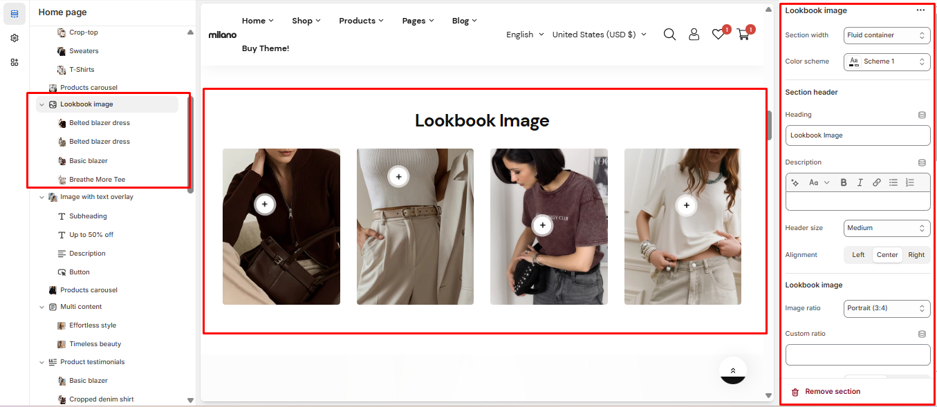
# Lookbook image
## General settings
| Setting | Description |
| ---------------------- | ------------------------------------------------------------------------------------------------------------------------------------- |
| Section width | You can choose among Fluid Container, Stretch width, Full width for the layout or just leave it with the default layout of the video. |
| Color scheme | You are allowed to change text color, background color, etc. with preset color. |
| Heading, description | Use the provided text fields to add a suitable heading/description. Leave any of them blank if you do not want to display them. |
| Header size, alignment | Adjust the text alignment (left/center/right) along with the font size. |
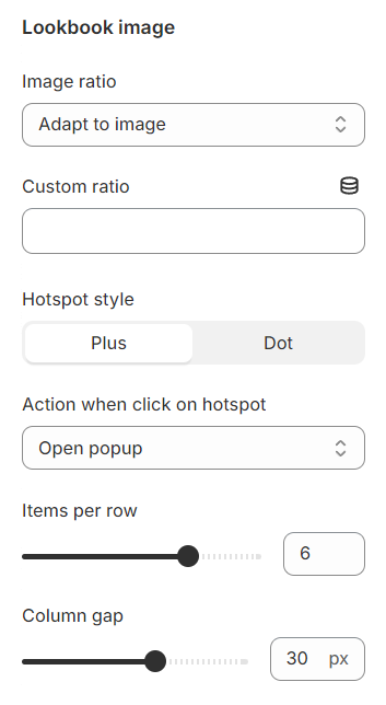
## Lookbook image
**Image ratio**: Select a preset ratio for the images.
**Custom ratio**: Define a custom ratio instead.
**Hotspot style**: Select either a plus sign or a dot sign for the hotspot indicator.
**Action when clicked on hotspot**: Choose to open a popup or redirect to a product page.
**Items per row:** This option lets you specify the number of products featured in each row, allowing for a customized layout.
**Column gap:** Adjust the spacing between two Instagram items to ensure a visually pleasing and well-organized layout within the Instagram block.
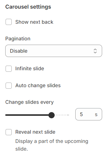
## Carousel settings
**Show Next/Back:** Display arrows to navigate to the next or previous item.
**Pagination:** Choose from different types of pagination options.
**Setup period time:** Configure the time interval for changing slides.
**Reveal next slide:** Allow a part of the next slide to be visible while the previous one is still displayed.
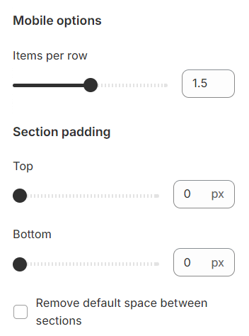
## Mobile options and Section padding
**Items per row:** In mobile view, the number of items displayed on each row in the grid layout can be customized to suit your preferences and the overall design of your site.
Section padding allows you to specify the space between this section and the preceding or following sections, or both.
## Block settings
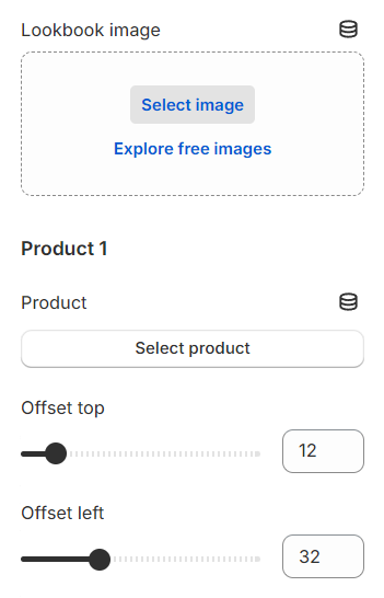
You can configure each lookbook to display an image and include up to 5 products within each lookbook, each marked by a plus sign. The position of these signs can be adjusted to precisely indicate where each product is featured within the lookbook image.