# Collection tab
{% hint style="success" %}
Steps
1. In the theme editor (**Customize**), click **Add section**
2. Locate **Collection tab**
3. **Save**
{% endhint %}
## General settings
| Setting | Description |
| ---------------------- | ------------------------------------------------------------------------------------------------------------------------------------- |
| Section width | You can choose among Fluid Container, Stretch width, Full width for the layout or just leave it with the default layout of the video. |
| Color scheme | You are allowed to change text color, background color, etc. with preset color. |
| Heading, description | Use the provided text fields to add a suitable heading/description. Leave any of them blank if you do not want to display them. |
| Header size, alignment | Adjust the text alignment (left/center/right) along with font size. |
## **Collection tab**
| | |
| -------------------- | ----------------------------------------------------------------------------------------------------------------------------------------------------- |
| Tab header style | You have the option to choose between two types of tab headers, offering different styles for layout customization. |
| Horizontal tab style | For the horizontal tab header type, there are two designs available to select from, providing variety in presentation. |
| Display mode | There are two types of product displays to choose from: grid and carousel, each offering a unique way to showcase products. |
| Items to show | This setting allows you to determine the number of products displayed in a single tab, giving you control over the quantity of items visible at once. |
| Item per row | This option lets you specify the number of products featured in each row, allowing for a customized layout. |
| Column gap | Adjust the spacing between products to ensure a clean and organized appearance, enhancing the shopping experience. |
## **Carousel setting**
| Setting | Description |
| ------------------- | ---------------------------------------------------------------------------------------------- |
| Show next back | Display arrows to navigate to the next or previous item. |
| Dot | Choose from different types of pagination options. |
| Infinite slide | Enable this option to allow the slides to loop continuously without stopping at the last item. |
| Auto change slides | Enable this option to automatically transition between slides after a specified time interval. |
| Change slides every | Configure the time interval for changing slides. |
| Reveal next slide | Allow a part of the next slide to be visible while the previous one is still displayed. |
## **Grid settings**
## **Section padding**
Section padding allows you to specify the space between this section and the preceding or following sections, or both.
### Mobile options
**Enable carousel on mobile:** Turn on this option to enable the carousel functionality for mobile devices, providing a seamless scrolling experience.
**Items per row:** Set the number of items displayed per row on mobile devices for optimal layout and usability.
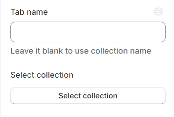
## Block settings
**Tab name:** This will be shown in place of the collection name if it's not left empty, allowing for customized or more descriptive titles.
**Select collection:** Choose the link that leads to the desired collection, providing a direct pathway for users to explore specific products or categories.