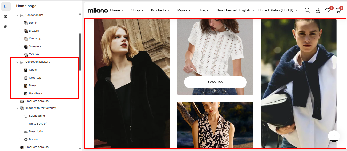
# Collection packery
The collection list displays a quick list of desired collections to catch visitors' attention.
{% hint style="success" %}
Steps
1. In the theme editor (**Customize**), click **Add section**
2. Locate **Collection packery**
3. **Save**
{% endhint %}
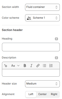
## General settings
| Settings | Description |
| ---------------------- | ------------------------------------------------------------------------------------------------------------------------------------------ |
| Section width | You can choose among Container, Wrapped container, Full width for the banner layout. |
| Color scheme | Set text color and background color with preset scheme |
| Heading, Description | Use the provided text fields to add a suitable heading/subheading/description. Leave any of them blank if you do not want to display them. |
| Header size, alignment | Adjust the text alignment (left/center/right) along with the background color and container type. |
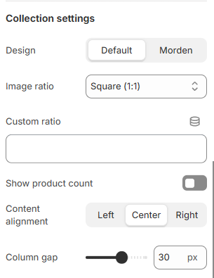
## **Collection settings**
| | |
| ----------------- | ----------------------------------------------------------------------------------------- |
| Image ratio | You can set the ratio for images with presets or set up your own ratio with Custom ratio. |
| Column gap | You are allowed to change both of them for mobile devices. |
| Content alignment | You can set the alignment for the content. |
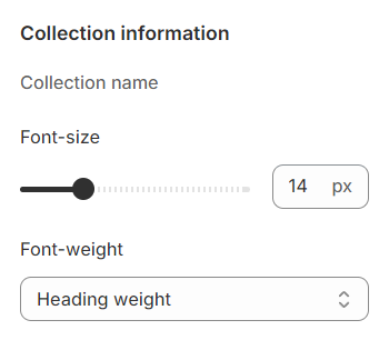
## **Collection information**
There are settings available for the title of the collection, including options to adjust the font size and font weight.
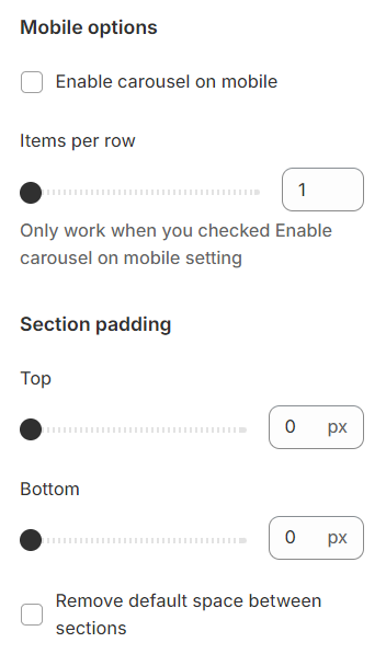
## **Mobile options and Section padding**
**Items per row:** In mobile view, the number of items displayed on each row in the grid layout can be customized to suit your preferences and the overall design of your site.
Section padding allows you to specify the space between this section and the preceding or following sections, or both.
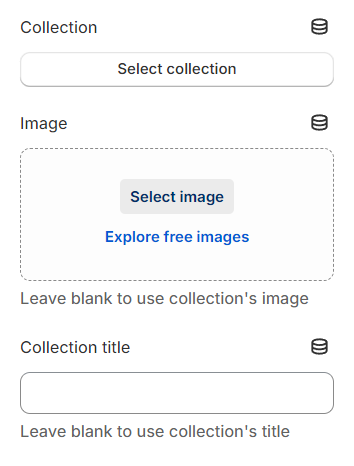
## Block settings
**Collection:** Choose the link that leads to the desired collection, providing a direct pathway for users to explore specific products or categories.
**Image:** This will be shown in place of the collection thumbnail if it's not left empty.
**Collection title:** This will be shown in place of the collection name if it's not left empty, allowing for customized or more descriptive titles.