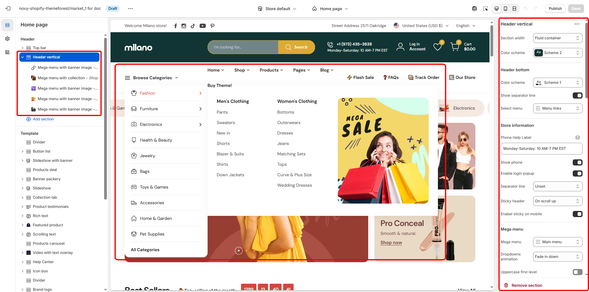
# Header vertical
We also offer three distinct layout blocks for the header mega menu, each designed to cater to different visual and navigational preferences.
* [Mega menu with banner image (Vertical menu type)](https://nextsky-2.gitbook.io/milano-shopify/header-group/header-vertical/mega-menu-with-banner-image-vertical-menu-type)
* [Mega menu with product (Vertical menu type)](https://nextsky-2.gitbook.io/milano-shopify/header-group/header-vertical/mega-menu-with-product-vertical-menu-type)
* [Mega menu with collection (Vertical menu type)](https://nextsky-2.gitbook.io/milano-shopify/header-group/header-vertical/mega-menu-with-banner-image-vertical-menu-type)
## General settings
## General settings
| Setting | Description |
| ----------------------- | --------------------------------------------------------------------------------------------------------------------------------------- |
| Section width | You can choose between Fluid Container, Stretch width, Full width for the layout or just leave it with the default layout of the video. |
| Color scheme | You are allowed to change text color, background color, etc. with preset color. |
| Phone Help Label | Configure the contact information displayed in your store's header. |
| Show email, phone | Enable to display the store's email and phone number for customer contact. |
| Enable login pop up | Enable the login popup to provide a quick and seamless login experience for users. |
| Separator line | Decide to show the separator line on which page. |
| Sticky header | Turn on the sticky header feature to keep the header visible at the top of the screen as users scroll down. |
| Enable sticky on mobile | Choose whether the sticky header feature should also be active on mobile devices, ensuring easy navigation across all platforms. |
| Transparent on homepage | Turn on the option for a transparent header, offering a sleek look to your site. |
| Enable in mobile | Decide whether to apply the transparent header feature to mobile devices as well, ensuring a consistent design across all platforms. |
| Text and icon color | Set the color for text and icons to match your store's branding. |
| Mega menu | Select from available mega menu designs or create a new one to enhance site navigation. |
| Dropdown animation | Choose an animation effect for when the dropdown menus are activated, adding a dynamic visual touch to the user interface. |
| Uppercase first level | Convert the first-level text to uppercase for a bold and structured appearance. |
| Layout | Configure the layout position for the horizontal navigation and vertical menu sections. |
| Vertical menu | Select a previously created vertical menu or set up a new menu. |
| Title menu | The heading for your vertical navigation section. |
| Collection Image Size | Controls the display size and aspect ratio for collection list images. |
| Limit show items | Set the maximum number of items to display in this section. |
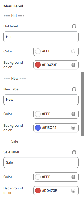
### Menu label
| Setting | Description |
| ---------------- | ------------------------------------------------------ |
| Label | Used to assign a label to the corresponding menu item. |
| Color | Set the color for label's text. |
| Background color | Set the background color for label. |
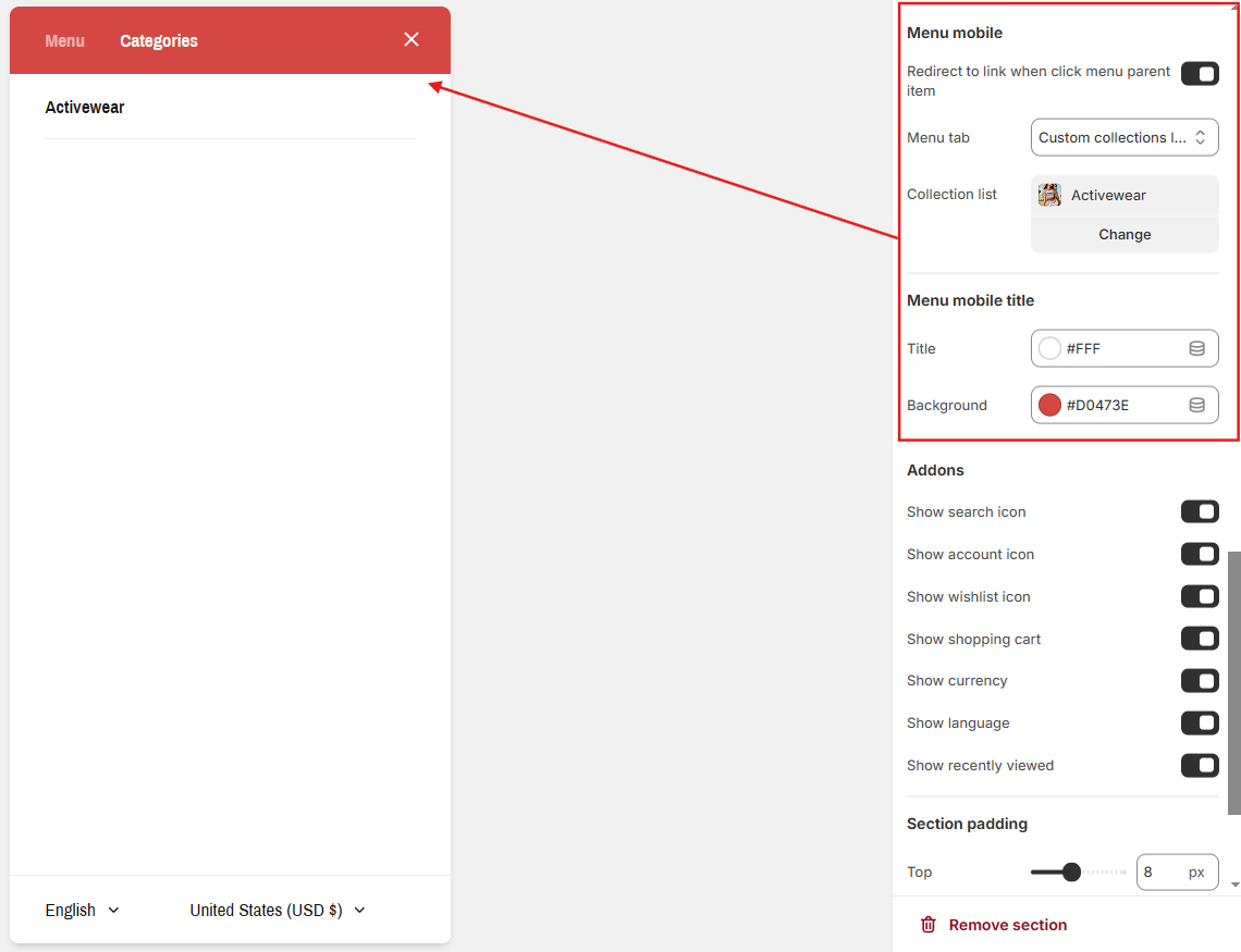
### Menu mobile
* **Mobile Menu Title Color**: "Customize the color of the mobile menu title."
* **Mobile Menu Background Color**: "Set the background color of the mobile menu."
* **Menu Tab with Collection List**: "Add a tab displaying a collection list for navigation."
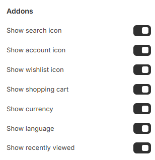
### Addons
You have the autonomy to select which icons or features are displayed, allowing you to tailor the interface to your preferences and the needs of your users.
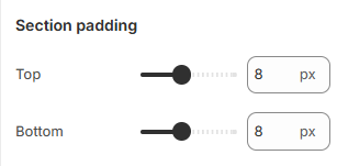
### Section padding
Adjust the padding to control spacing within the section.
## Block settings:
| Setting | Description |
| --------- | ----------------------------------------------------------------------------------------------------------------------------------------------------------------------------------------------------------------------------------------------------------------------------------------------------------------------------------------------------------------------------------------------------------------------------------------------------------------------------------------------------------- |
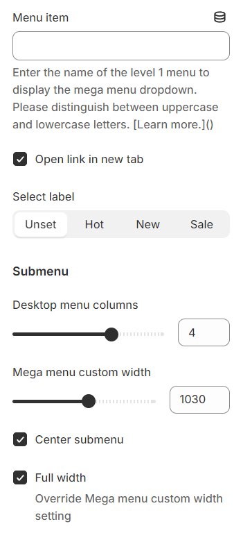
| Menu item |
Specify the name of the menu item to which the layout will be applied.
Configure the vertical menu by selecting the top-level (level 1) menu items from your chosen navigation.
|
| Submenu |
Desktop menu columns: The submenu settings include the option to determine the number of columns for the desktop menu.
Mega menu custom width: You can also set a custom width for the mega menu.
Center submenu: Align the submenu to the center.
Full width: If you select full width, it will override any custom width setting, expanding the menu across the entire screen width.
|
### **Adding Icons to Vertical Menu Level 1 Items:**
Each menu item level 1 corresponds to a collection, you need to create a custom metafield for that collection to upload the icon file (can be an image or svg).
{% hint style="success" %}
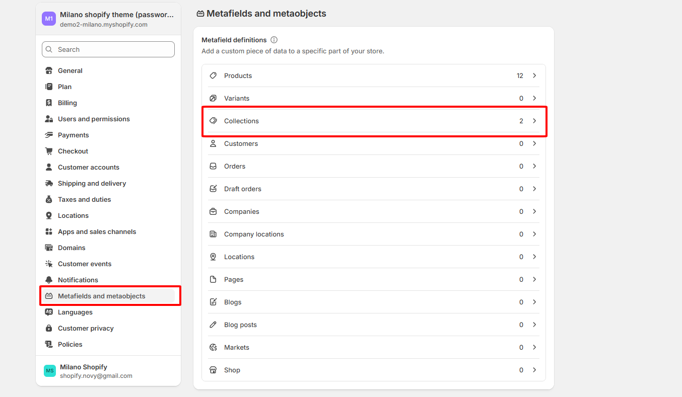
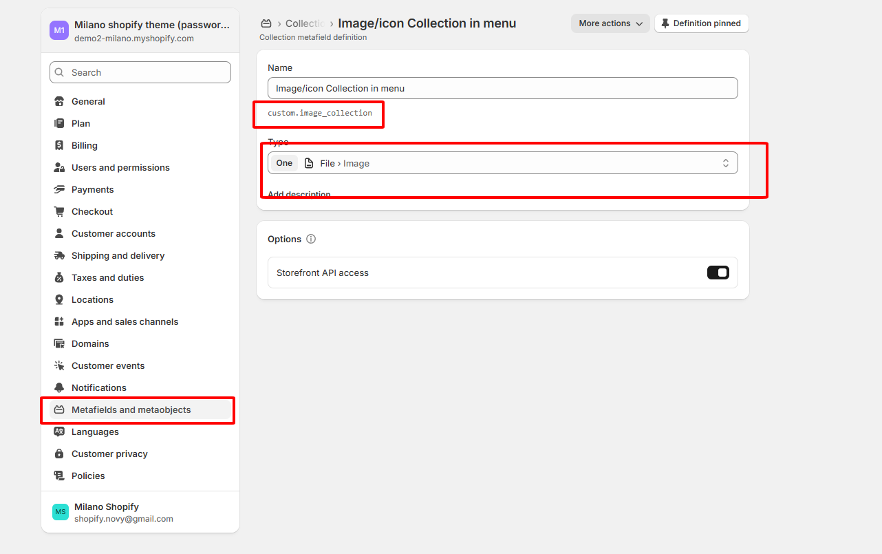
**Step 1: Create the Custom Metafield for Collections**
1. Go to **Settings** > **Custom data** in your Shopify Admin.
2. Click on **Collections**.
3. Click **Add definition**.
4. Configure the metafield as follows:
* **Name:** `Menu Icon` (or your preferred name)
* **Namespace:** Image/Icon collection in vertical menu
* **Key:** custom.image\_collection
* **Type:** Choose **File**. In the "File types" dropdown, select **Image** and/or **Generic file** (if using SVG).
5. Click **Save**.
{% endhint %}
{% hint style="success" %}
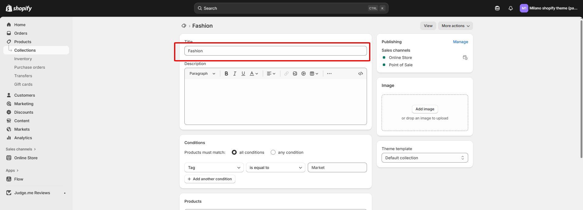
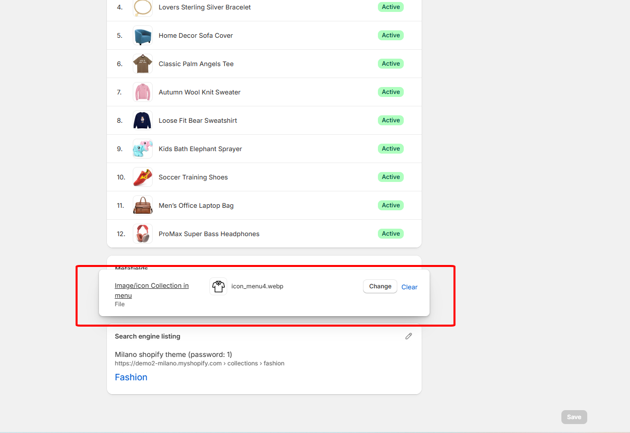
**Step 2: Upload an Icon to a Collection**
1. Go to **Products** > **Collections**.
2. Open the collection you want to add an icon to.
3. Scroll down to the **Custom data** section. You will see your new "Menu Icon" field there.
4. Click **Upload file** and select your icon (Image or SVG).
5. Save the collection.
{% endhint %}